About
Flora is a company based in Vancouver and they hope to make the flower-gifting process easier for customers. They specialize in bouquets and flower arrangements, ready for all their customers’ needs.
Goal
Create a designated mobile app where customers can order flowers, design a bouquet or floral arrangement, and buy merchandise easily.
Process
Initial Stage
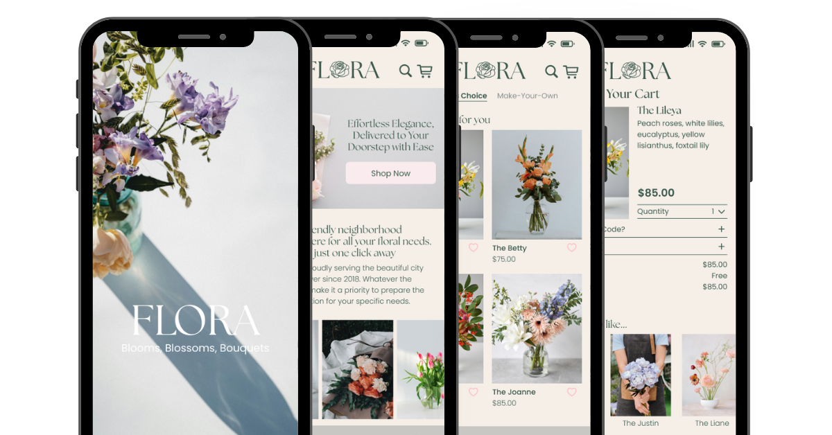
Before starting the designs and sketching, we discussed the brand guide. We wanted the brand to have a light and airy feel, so we chose the following color palette: pink (#faecee), off-white beige (#f5efe8), tan (#e8d3c1), grey (#d5d6d0), light green (#81ab7f), and dark green (#3c594b). These colors represent Flora best because the tones reflect a calming bouquet. We wanted Flora to give off a luxurious feel, so we also ensured our font choices worked well with the colors to reflect that. The header font we chose was ‘The Seasons,’ paired with ‘Poppins’ for the body font.
Low-Fidelity Wireframes
The tough part was discussing what features needed to be included within the app; we had to map out how a typical user who is looking to order flowers for delivery would navigate our app.

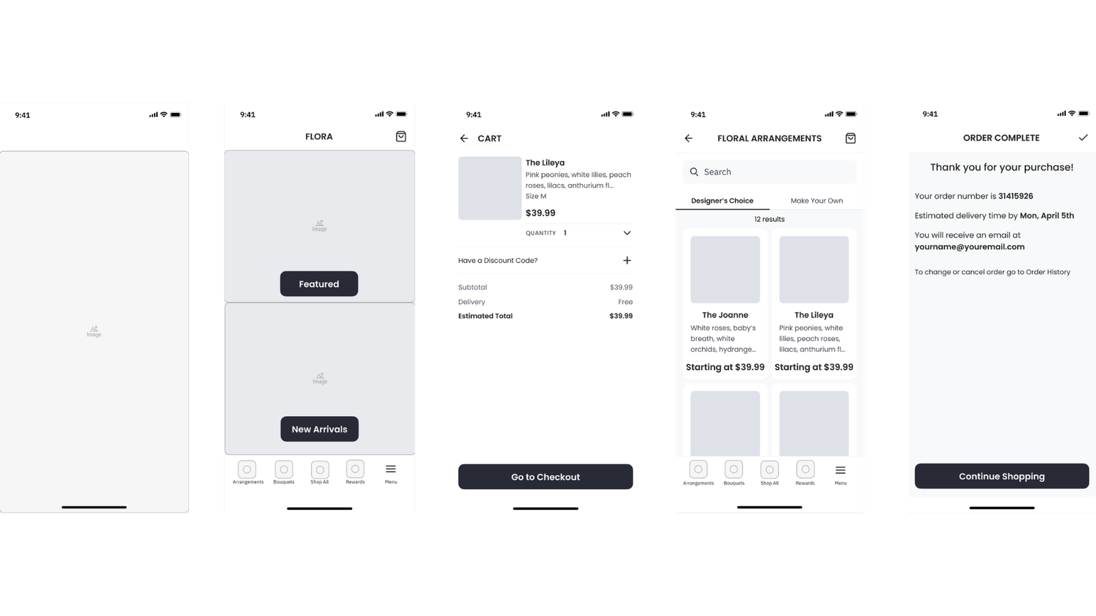
We came up with a quick user flow consisting of steps our users need to take, this includes being able to browse a shop page, add item(s) to cart, checkout, and know that their order has been confirmed. Due to the limited timeframe of this project, our final product consisted of 5 wireframes: the splash screen, home page, shop page, cart, and order confirmation page.
Home Page Changes
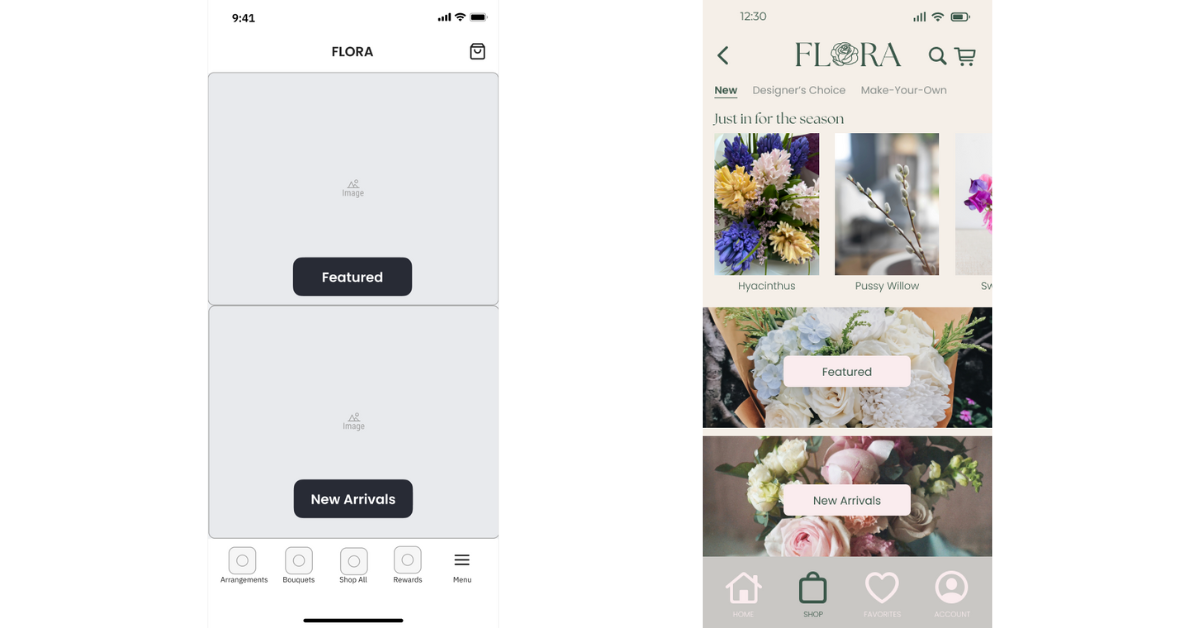
I evaluated the project again and made notes of areas that required improvement. The home page seemed empty with only 2 tabs (featured and new arrivals) making it seem like a shop page rather than a home page. I decided to add some more details about the brand itself on there and include some floral shots to capture the user’s attention. I made sure to include a button on the home page that can direct the user quickly to browse the product page.

As for the navigation bar, I felt that certain pages could be combined to cause less confusion for users and include a designated button for the user to access the home page from the other pages. I broke down some of the other pages further to ensure user’s had a clear understanding of what products would be on a specific page, with the corresponding title tabs clearly labeled above.
Cart Page Changes
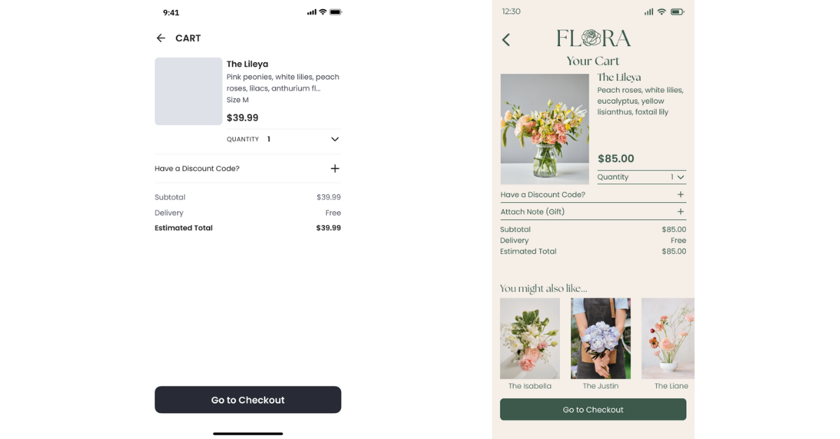
For the cart page, I added a section that would allow the user to attach a note with the flowers; it’s quite common for flowers to be purchased for delivery for special occasions, and having the option to attach a personalized note can add that special touch, so I knew that needed to be added.

On this same page, I attached a ‘you might also like…’ section with a scrolling carousel by the ‘go to checkout’ button so it can hopefully influence users to add more products before placing their order. Some additional pages I designed and added within Figma are the product page, sign-in page, and payment page.
UI Guide
The brand guide created for Flora helped to ensure components were consistent throughout all designs.

